BON SECOURS / ST. FRANCIS HEALTH SYSTEM | BRANDING
My Role - Creative Director, Illustrator, Storyboard Artist, and Character Designer
Assignment - Create a character-based brand that makes Bon Secours’ medical accomplishments known in a way that respects the past, is fun, and full of relevant promise.
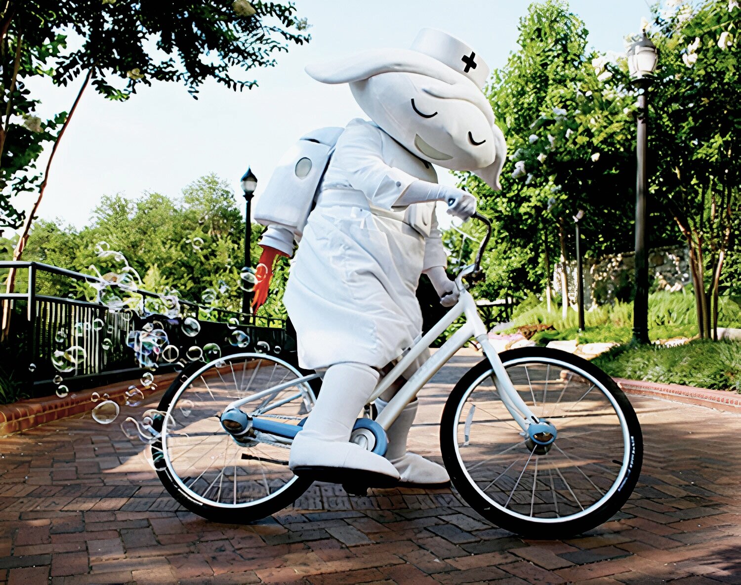
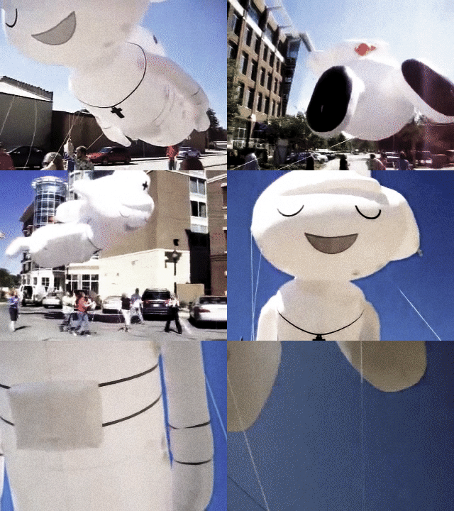
Project Scope - Website, brochure, outdoor, event, mascot, 35’ Macy Day Parade style flying balloon, a separate site called, “Happy in Greenville”, 6 animated TV spots, and magazine ad design.
Honors - Multiple Gold Addy Awards including Best of Show
“Many things in health care have changed tremendously since 1932 when the Sisters of St. Francis arrived in Greenville to run a hospital that would serve poor cotton mill village residents. But one thing hasn’t in those 85 years — Bon Secours St. Francis’ focus on improving the health of those who live in the surrounding community.” - Greenville Journal
TV Commercials
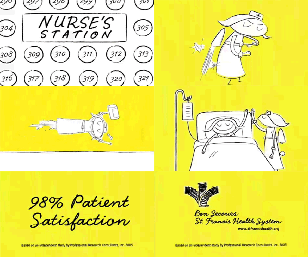
“Jetpack Nurse”
I’ll never forget when creative genius (and I do mean genius) Greg Cordell, suggested I add a jetpack to my character’s design, or when our client named her, “Faith”, or how shortly after the commercials aired, the Bon Secours’ staff drew pictures of her and posted them all over the hospital.
Stickers of Faith (and the supporting cartoon cast) appeared on the rear windows of cars all over our city.
The campaign had struck a chord with the people of Greenville and become a beloved brand.
And while I did work hard on this project for several years, the real magic, as I reflect on it, came from having a brave and brilliant client, an imaginative account manager who’d built trust with our client, Greg Cordell (my mentor) who pushed me to push every idea, great animators, and the Brains on Fire team who championed this super daring (for any hospital) approach.
The campaign was loved. And it worked.
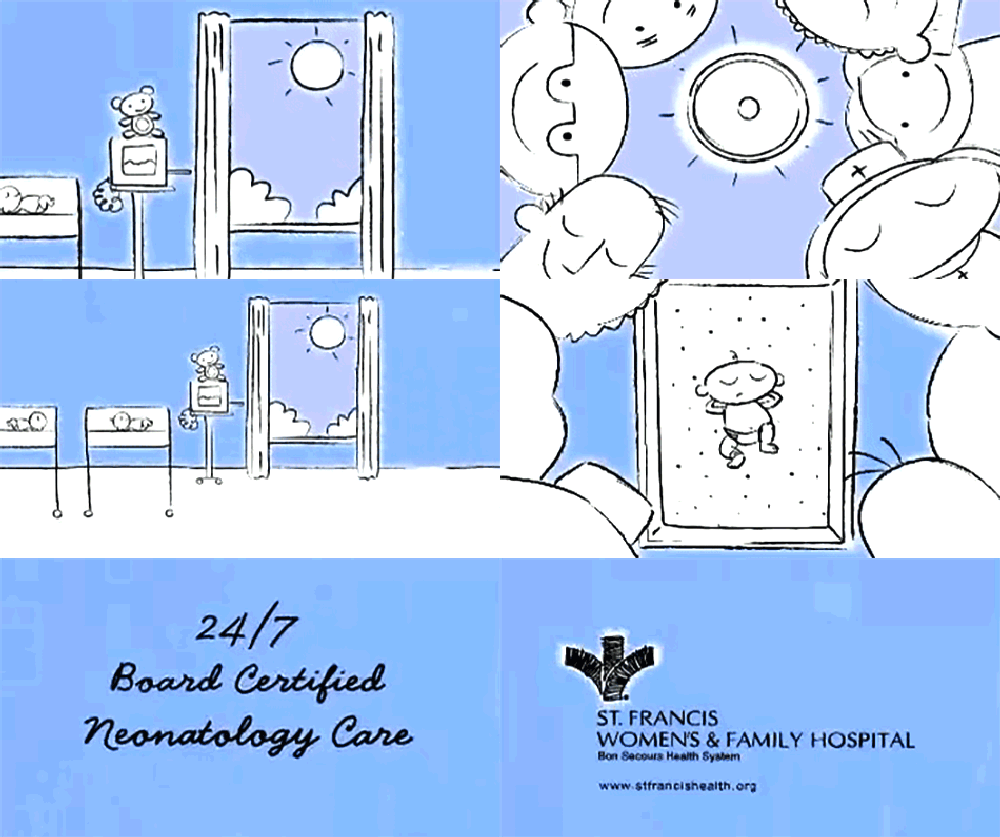
“24/7 Neonatal Care”
Exactly how attentive is the Neonatal team of doctors and nurses at Bon Secours, you might ask?
Extremely.
In our original commercial, our preemie cried - the team rushed in - she was fine - they left.
Night came - more crying - and SFX: toot!
Ah, she’s a little gassy. All is well.
We aired this spot and apparently, some hospital leadership felt the toot was too edgy. They asked us to change it to a burp… which we did.
That’s when the letters and emails from viewers all over the state started showing up exclaiming, “Bring back the tooting baby!”
And this was the point, where we knew we had something.
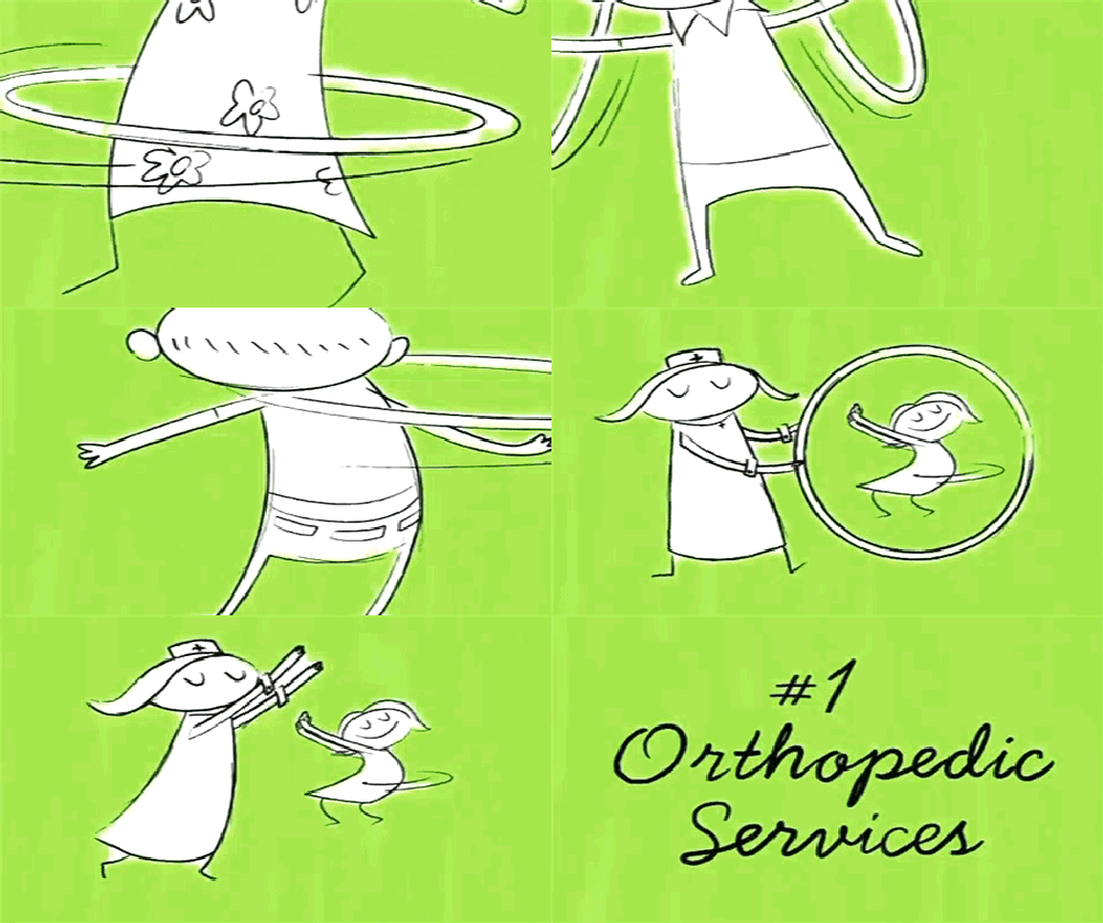
“Number 1 in Ortho ”
I once worked with a writer who had a great saying. It went like this… Are you going to tell me you’re funny or tell me a joke?
This was profound to me then and remains profound to me now. Show people what they can be doing with Orthopedic Surgery - don’t tell them. That’s what I tried to do with this commercial.
I’m pretty sure that the hula-hoop becoming the “O” in orthopedic was another of Greg Cordell's ideas. And the guy pulling up his pants was something my animators added in.
Everyone was chipping in on making these small-budget little commercials special.
Creating this campaign had some seriously challenging moments. But then there were days I’d get things back from the animators, like the pants being pulled up - and those days felt like Christmas morning.


